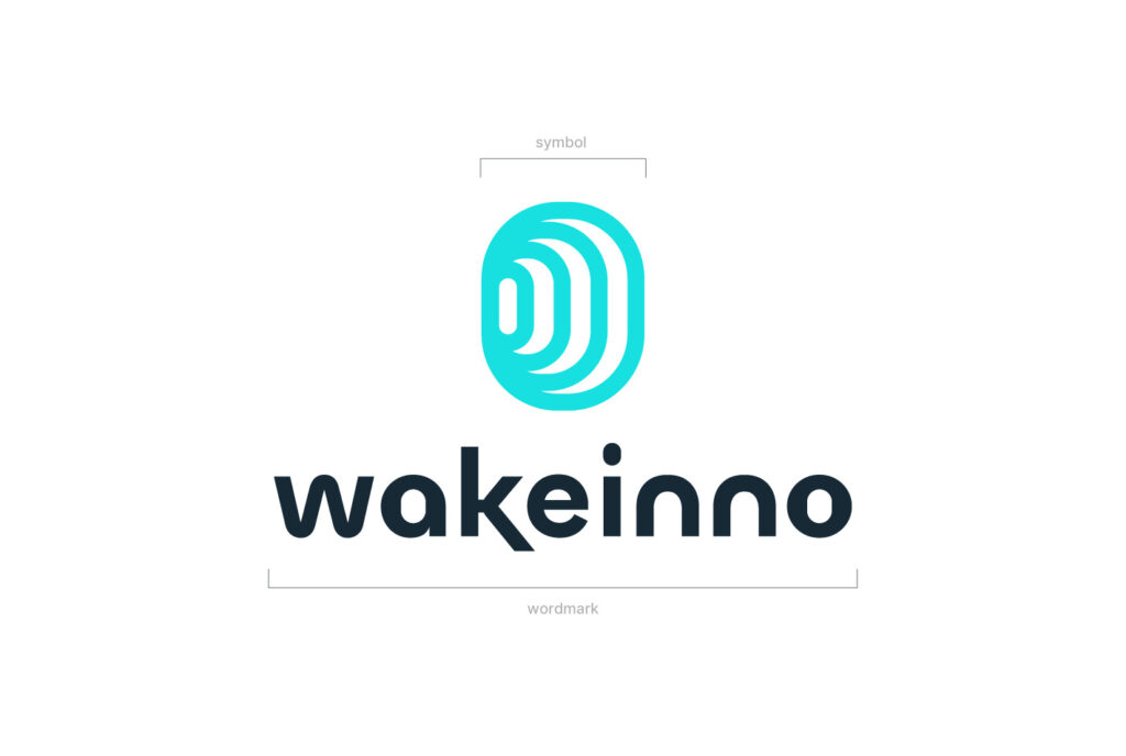
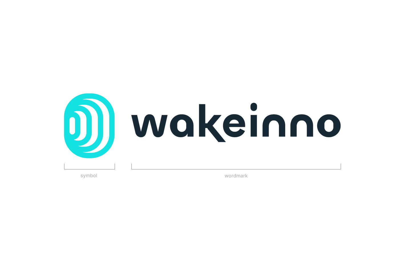
The Wakeinno logo consists of two elements: the symbol and the wordmark. The symbol can be used independently when space is limited, such as for app icons, social media avatars, and presentation slides.
Secondary Version
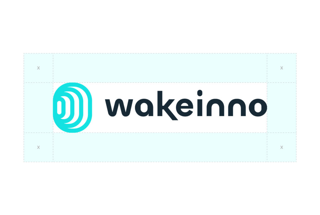
Use the horizontal version of the logo if it fits better in the available space. Only use the logo on a single line when vertical space is limited, ensuring that it remains clear and legible.
Logo Colors
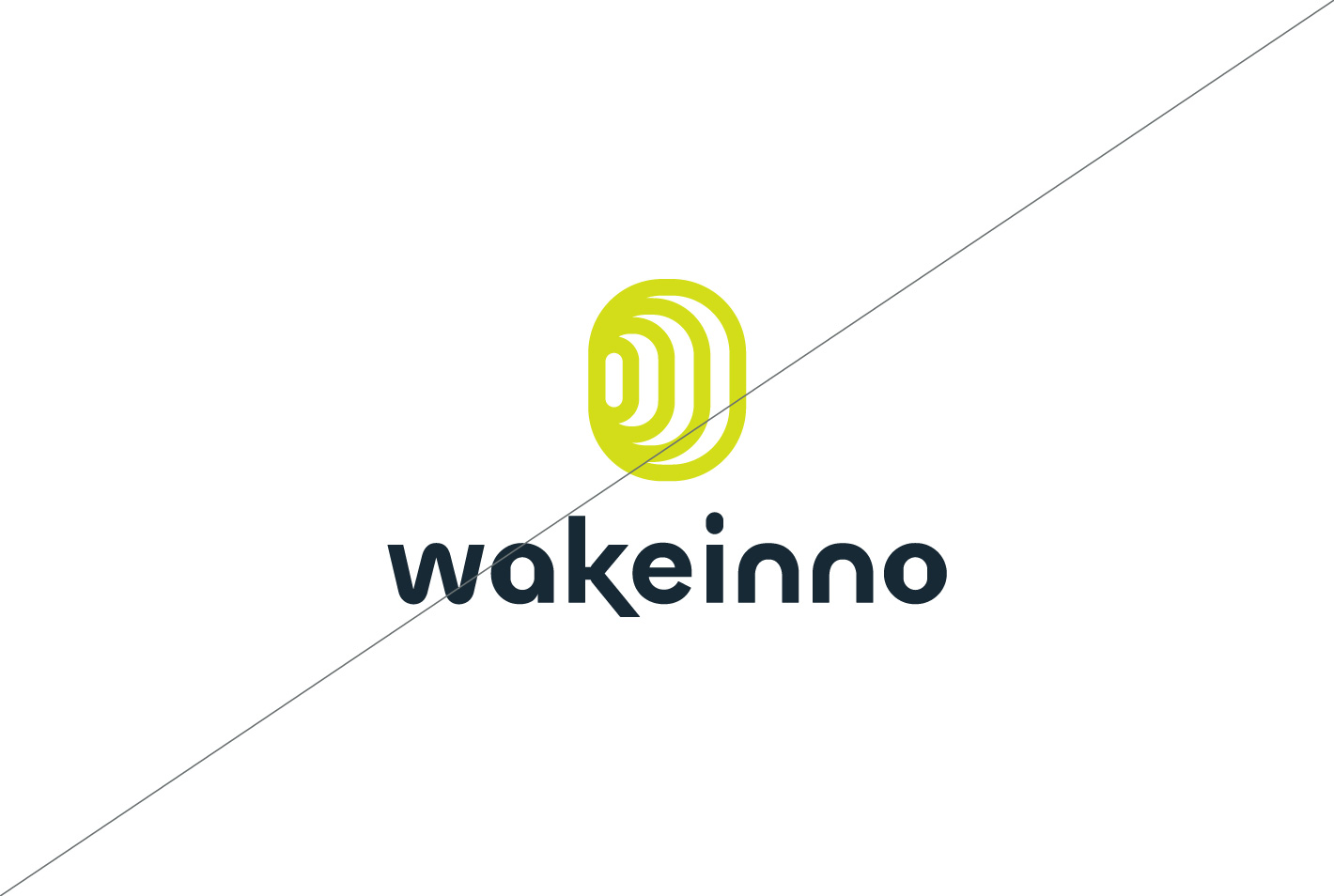
When combining the logo with brand colors, make sure there is sufficient contrast. Below are some examples of approved combinations.
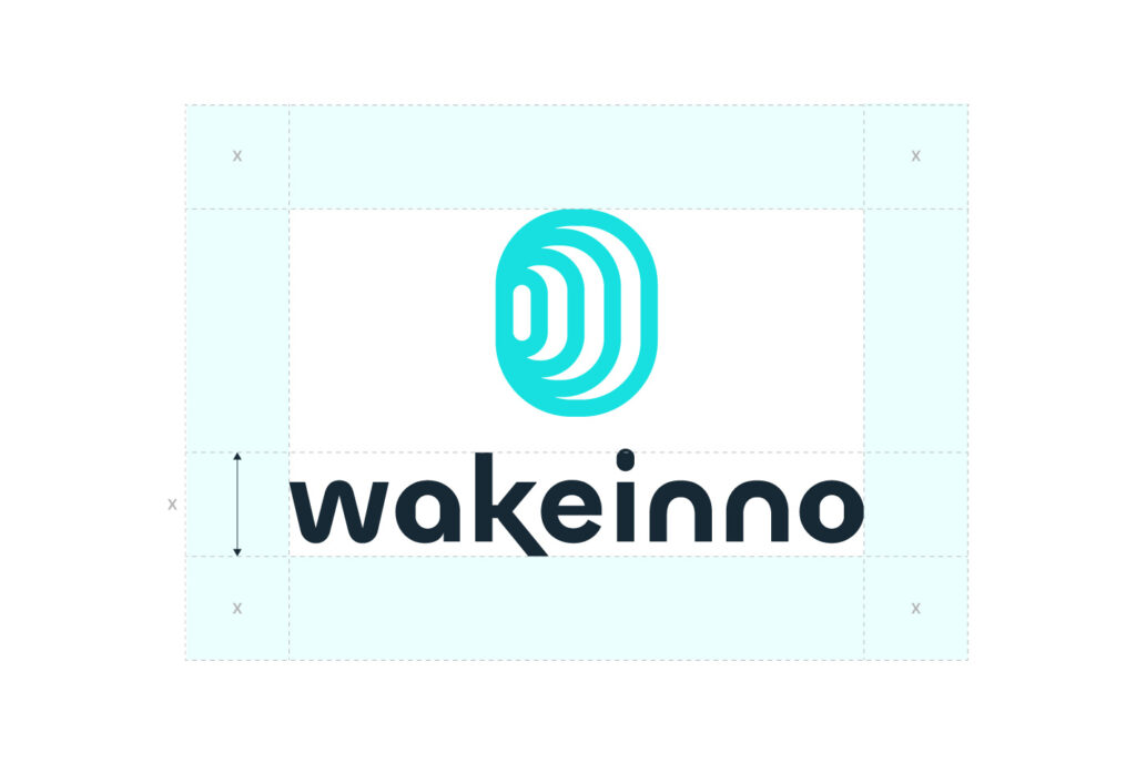
Clear Space
Always ensure there is space around the logo. When placing elements near the logo, use the height of the wordmark [X] as a guide for spacing. Make sure nothing interferes with this space.
Minimum Size
Always use good judgment when resizing the logo. It has been designed to remain legible at all sizes, but avoid using it below the indicated minimum size to ensure it stays clear and recognizable.
Digitale:
H 18px
Print:
H 10mm
Digitale:
H 8px
Print:
H 6mm
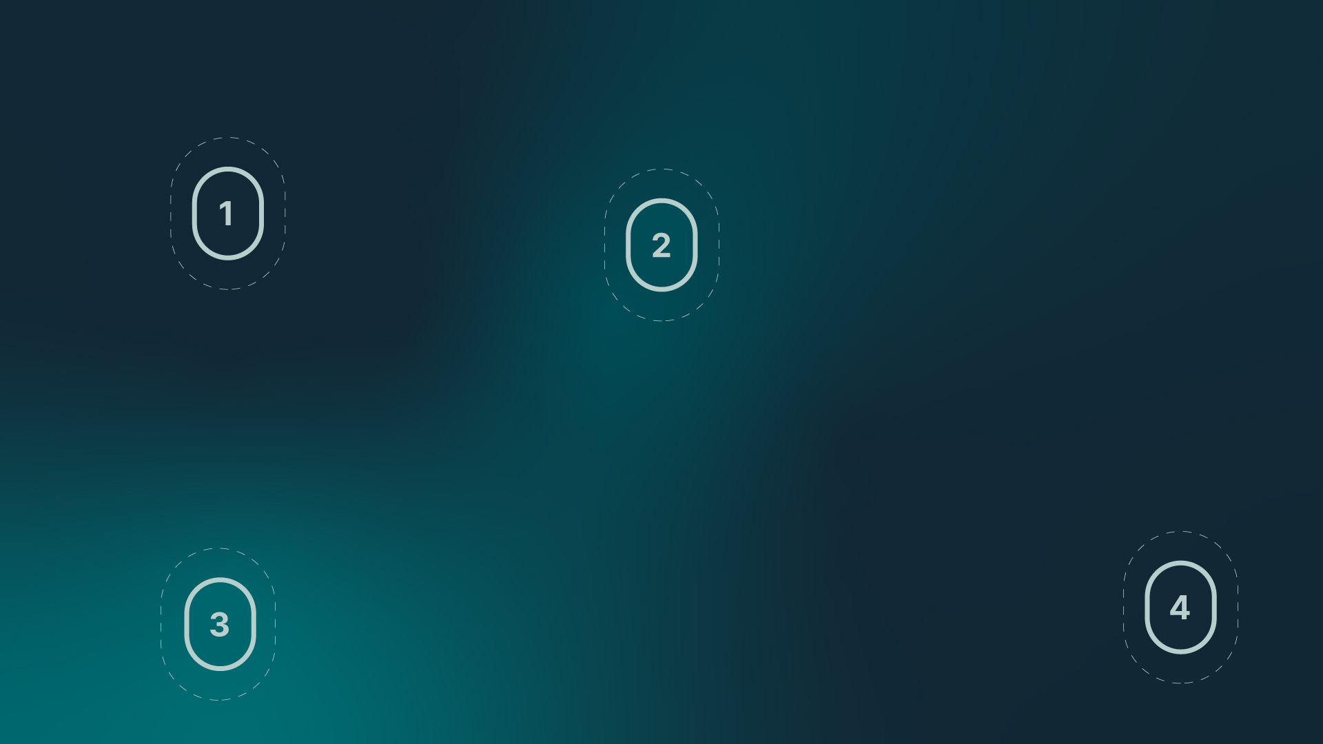
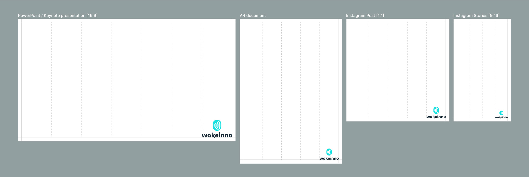
Size in Composition
When positioning the logo within communication materials, resize it proportionally. There is no strict rule, but as a guideline, use between 1/4 and 1/8 of the total width of the entire area as the minimum space for the logo.
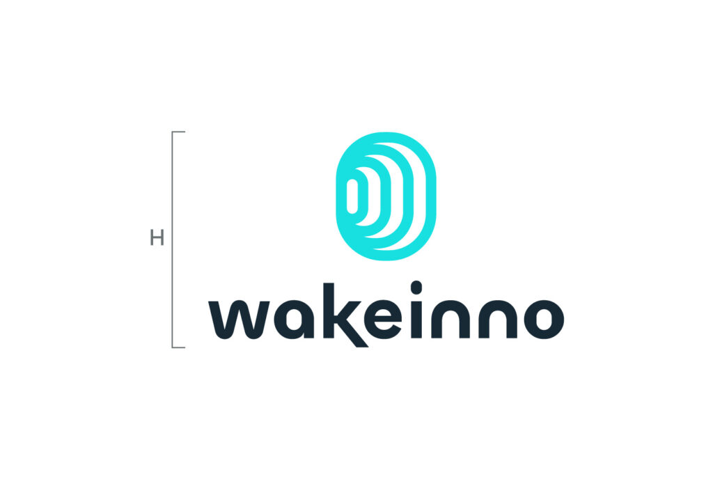
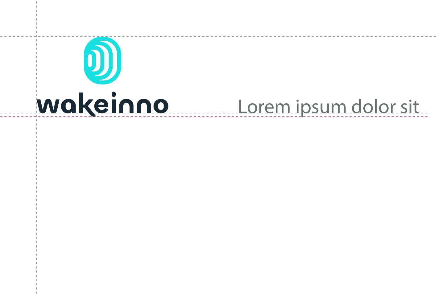
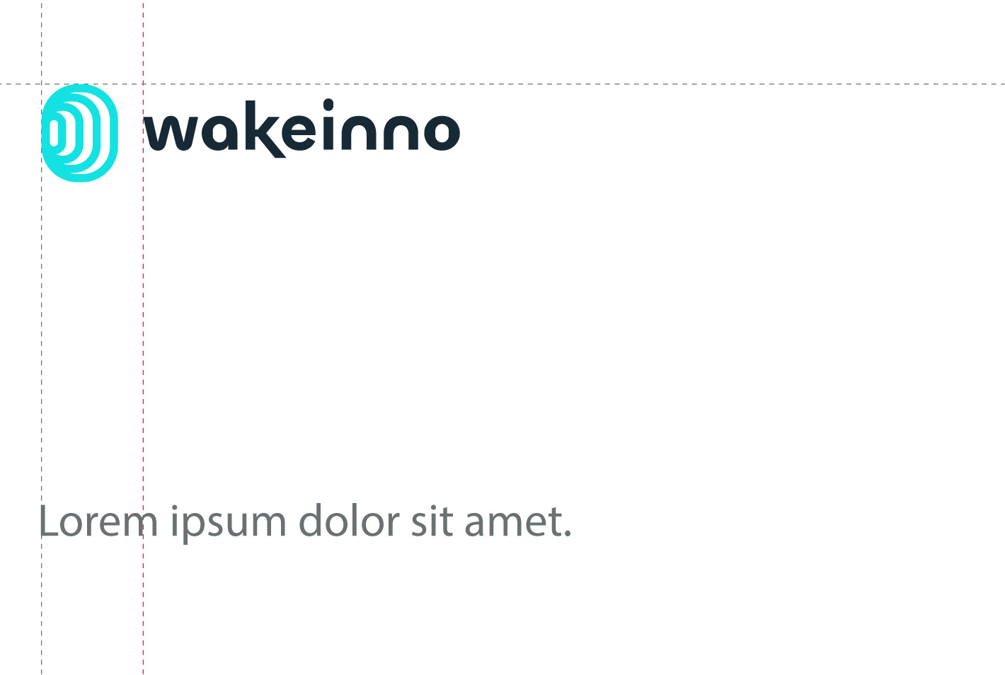
Logo Alignment
Align the logo to the top margin with the symbol, and to the bottom margin with the wordmark in the primary version. In the secondary version, always align the logo with the symbol.
The typography is aligned with the “w” of Wakeinno.
The typography is aligned with the symbol.
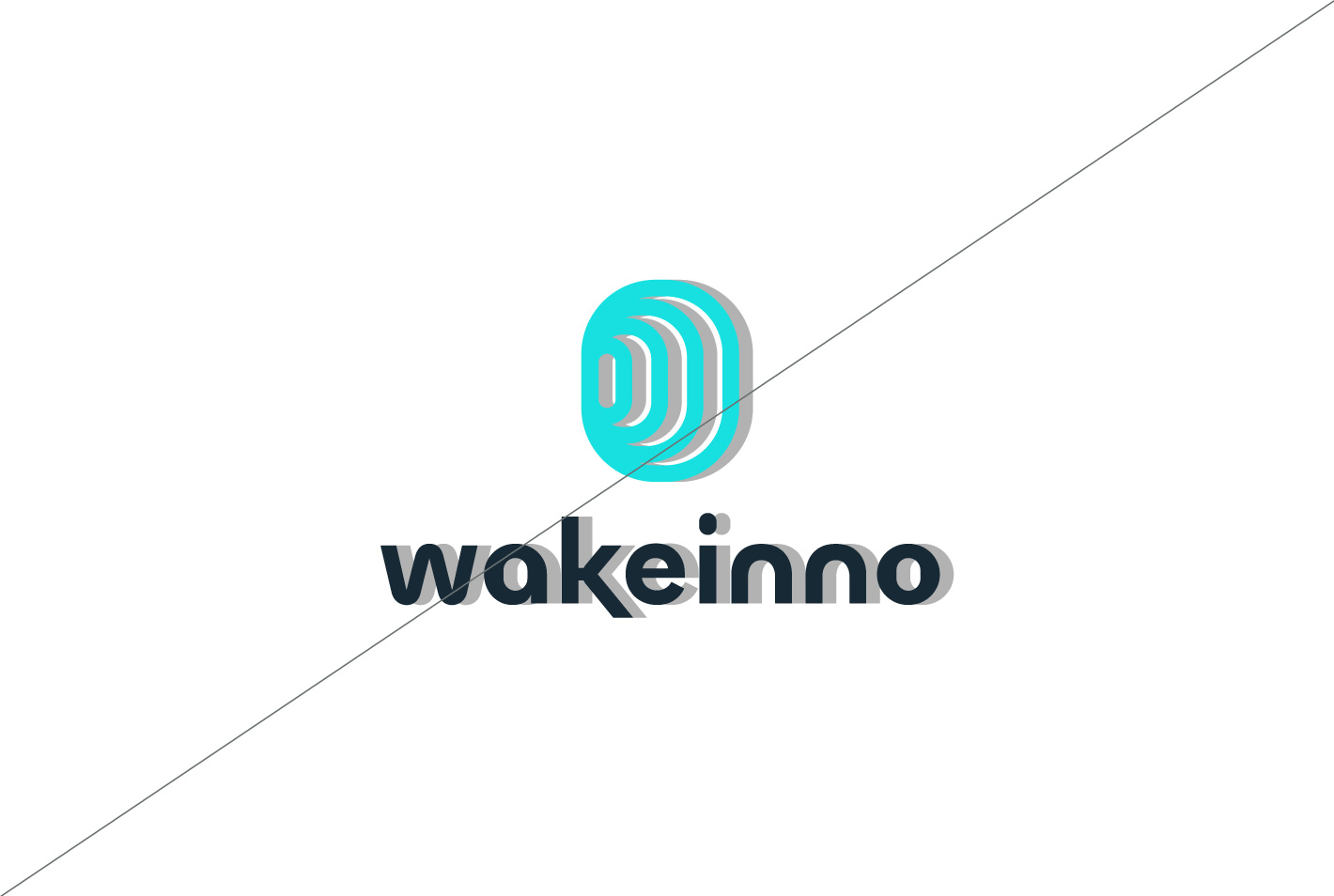
Incorrect Uses
Avoid using the logo incorrectly, as this can create confusion and make brand recognition difficult. Here are some examples of uses to avoid.
Do not stretch the logo.
Do not use unapproved colors.
Do not rotate the logo.
Do not apply shadows or effects.
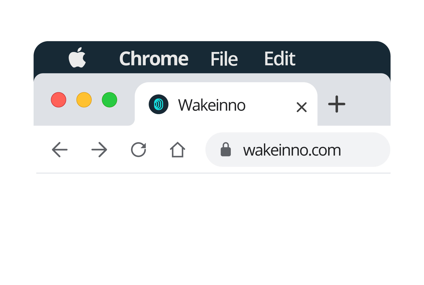
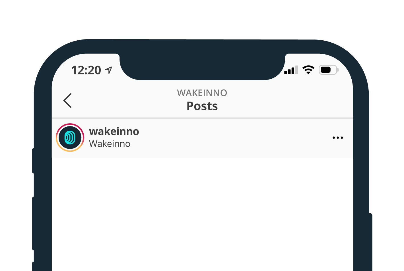
Social Media and Favicon.
The logo symbol can be used as a social media avatar and website favicon. Ensure it’s centered, with no overlaps, and uses approved color combinations. Avoid complex backgrounds, and test for readability across different resolutions.
Colors
The palette conveys stability and professionalism while expressing innovation.
Primary colors
The primary colors to use include blue, primarily for backgrounds, while green serves as a valid alternative. Cyan and yellow can be used as accent colors to enhance the design.
Blue
#172935
RGB 23, 41, 53
CMYK 93, 71, 53, 63
Cyan
#17E0E0
RGB 23, 224, 224
CMYK 62, 0, 22, 63
Green
#00646B
RGB 0, 100, 107
CMYK 87, 37, 46, 28
Yellow
#F9ED0D
RGB 249, 237, 13
CMYK 8, 0, 87, 0
Neutral colors
The palette includes four neutral colors that provide a balanced and sophisticated foundation, ensuring visual consistency with the primary and accent tones.
Dark gray
#6A7172
RGB 106, 113, 114
CMYK 58, 41, 43, 26
Medium gray
#929FA0
RGB 146, 159, 160
CMYK 47, 27, 32, 8
Gray
#BBCECD
RGB 187, 206, 205
CMYK 33, 10, 20, 0
Light gray
#E3FCFB
RGB 227, 252, 251
CMYK 15, 0, 6, 0
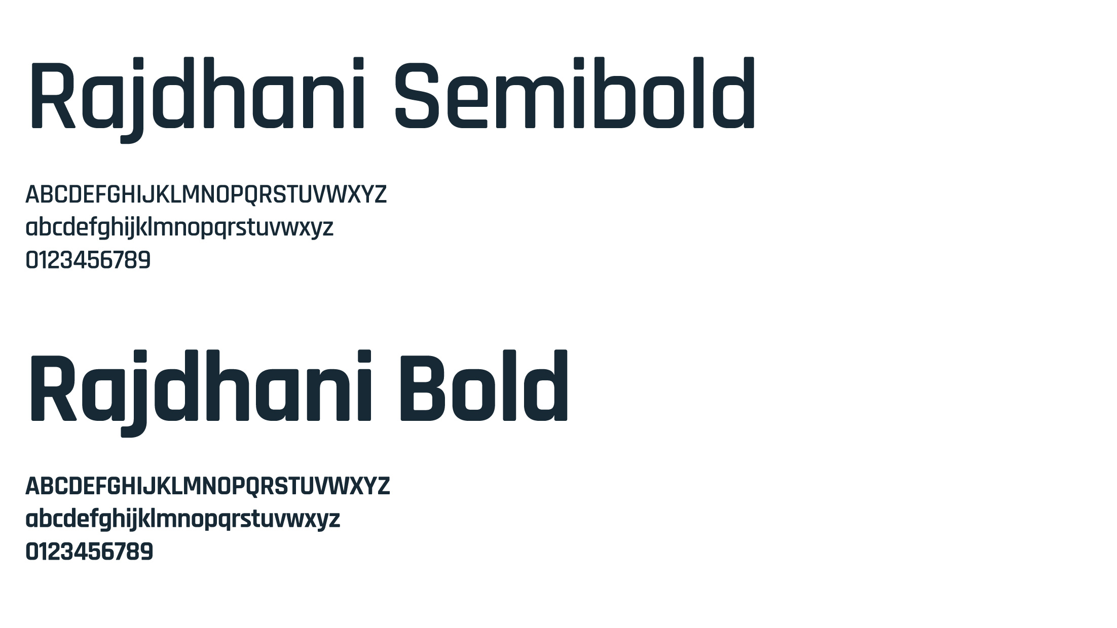
Typography
The typeface reflects innovation through clean, geometric lines.
Rajdhani
The Rajdhani font should be used in titles with two weights: semibold for all content and bold exclusively as a primary element, such as on presentation covers.
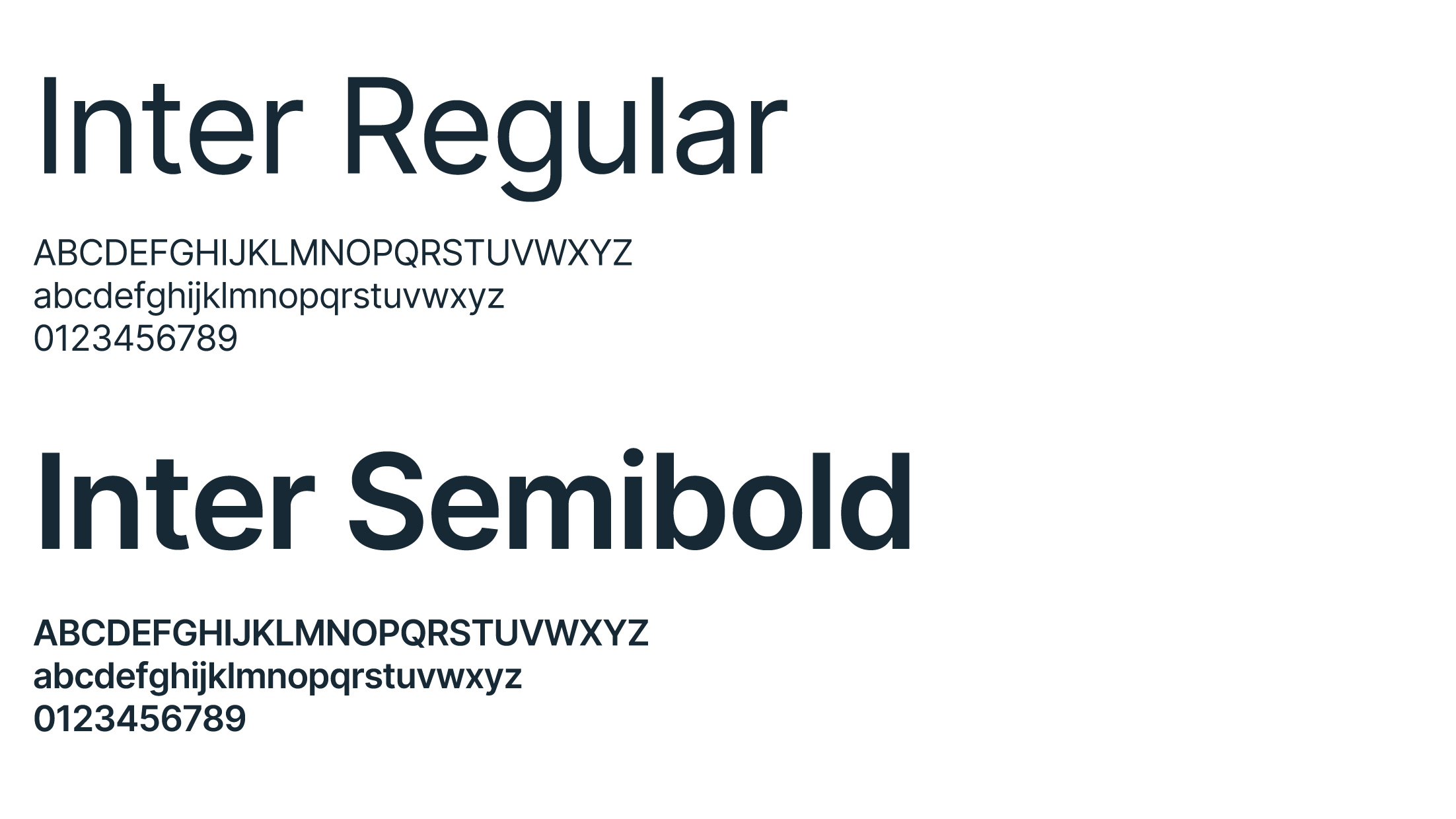
The Inter font should be used in either Regular or SemiBold weight. Regular is ideal for body text, ensuring clarity and legibility, while SemiBold can be employed to highlight important points or sections within the content.
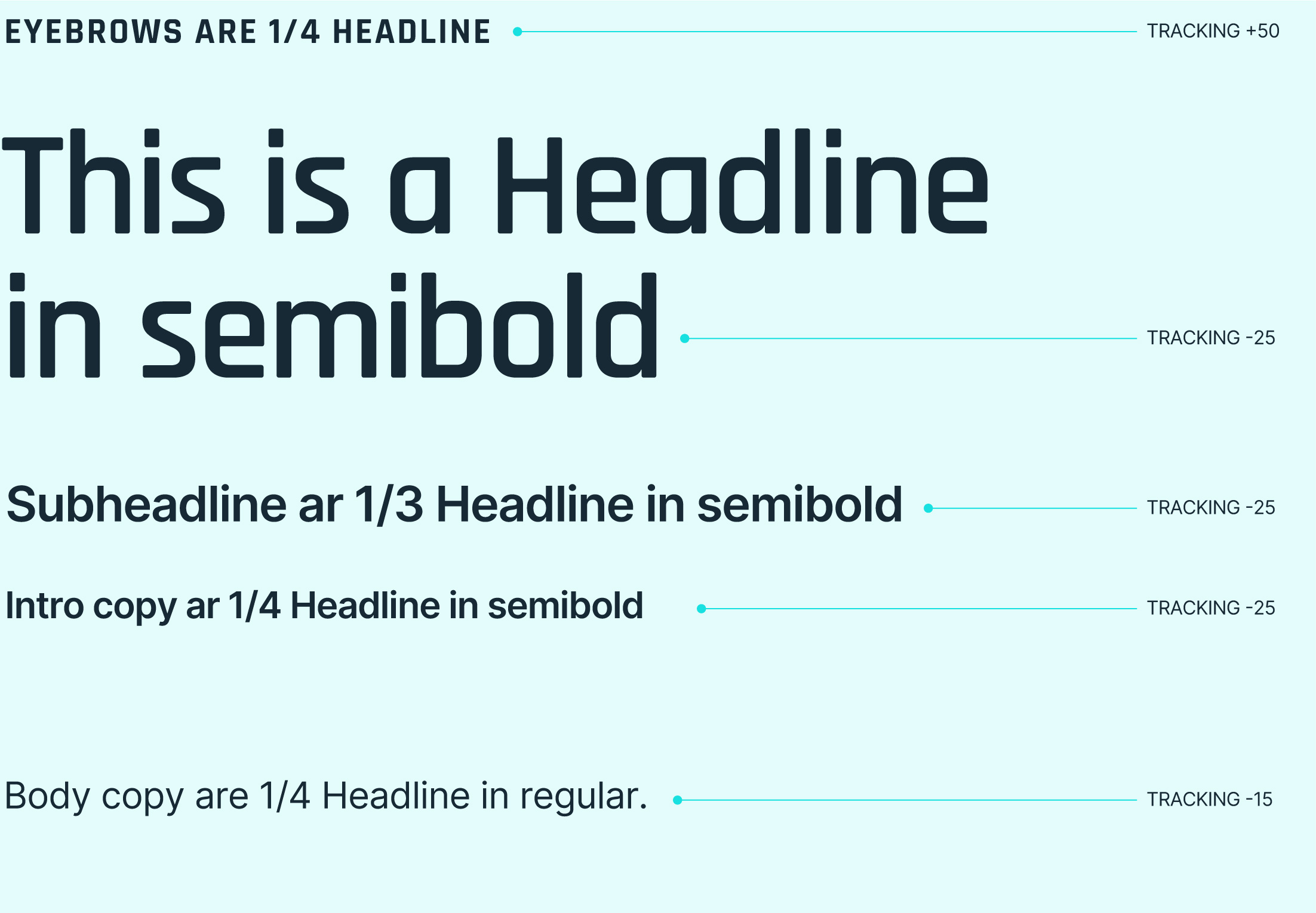
Uppercase/Lowercase We use lowercase for most communications, including titles. Uppercase is reserved for eyebrow text and buttons.
Proportions Font sizes are calculated based on the point size of the Headline. For instance, if the Headline is 125 pt, use the formula: Headline/4 for Eyebrows and Headline/3 for Subheadlines ecc., rounding to the nearest even number.
Tracking (letter spacing) Letter spacing is reduced, except for Eyebrow text, ensuring that the letters never touch.
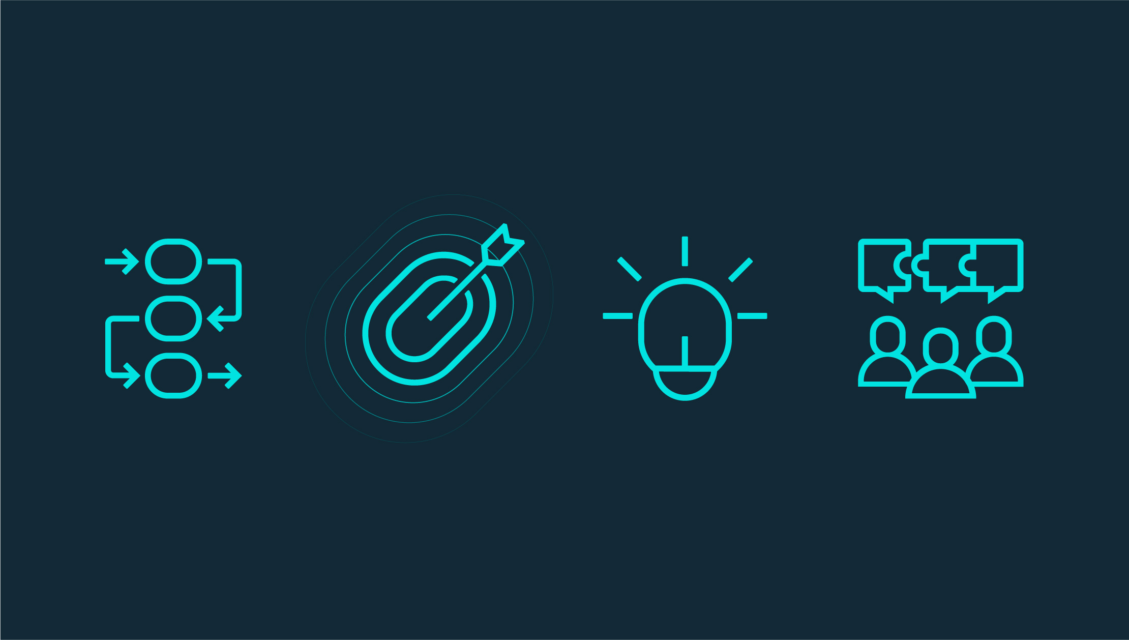
Iconography
Use icons to enhance the user experience with intuitive navigation, concise communication, and an appealing visual design.
Grid The icons are designed on a 32×32[X] Grid, with a 2[X] padding around each icon.”
Line thickness The thickness should be 1[X]
No sharp angles Avoid sharp angles, prefer rounded corners.
No circles Where possible, always use an elliptical shape that resembles the Logo instead of a circle.
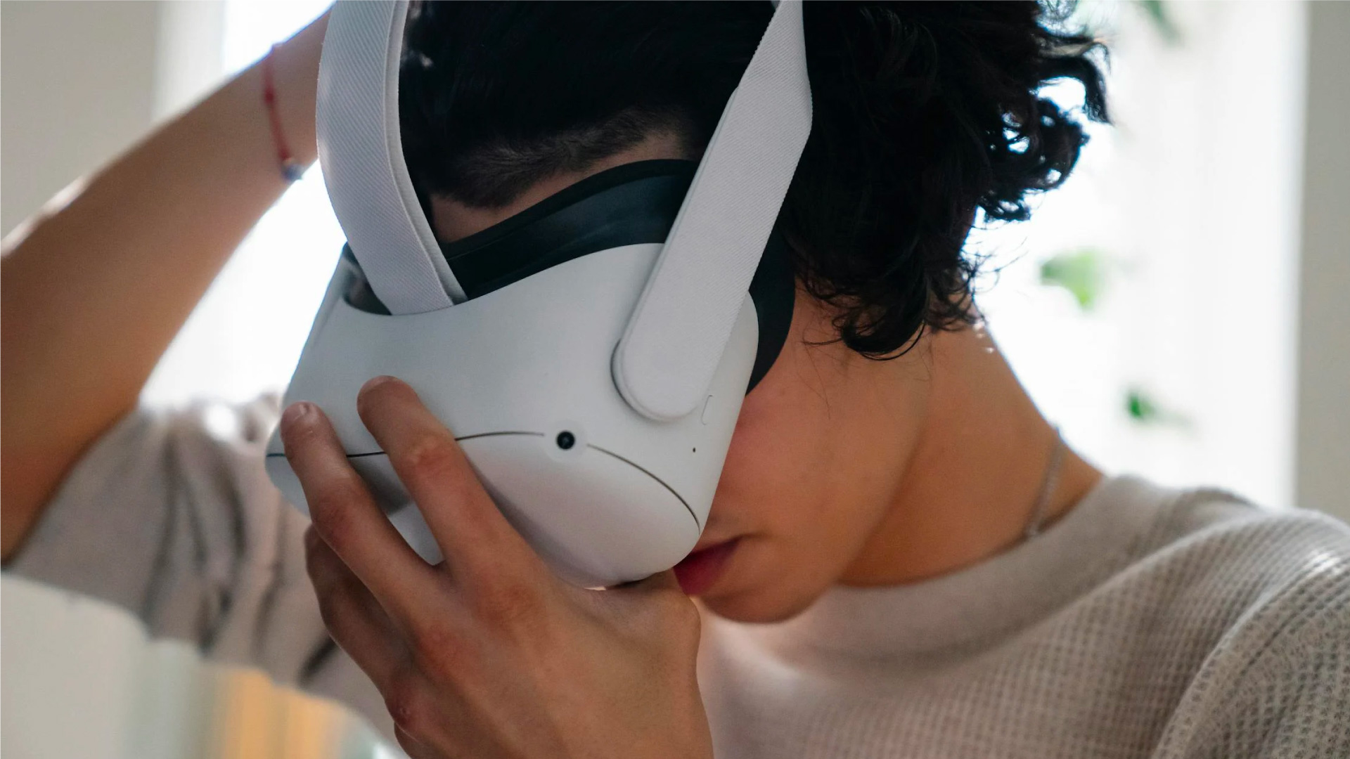
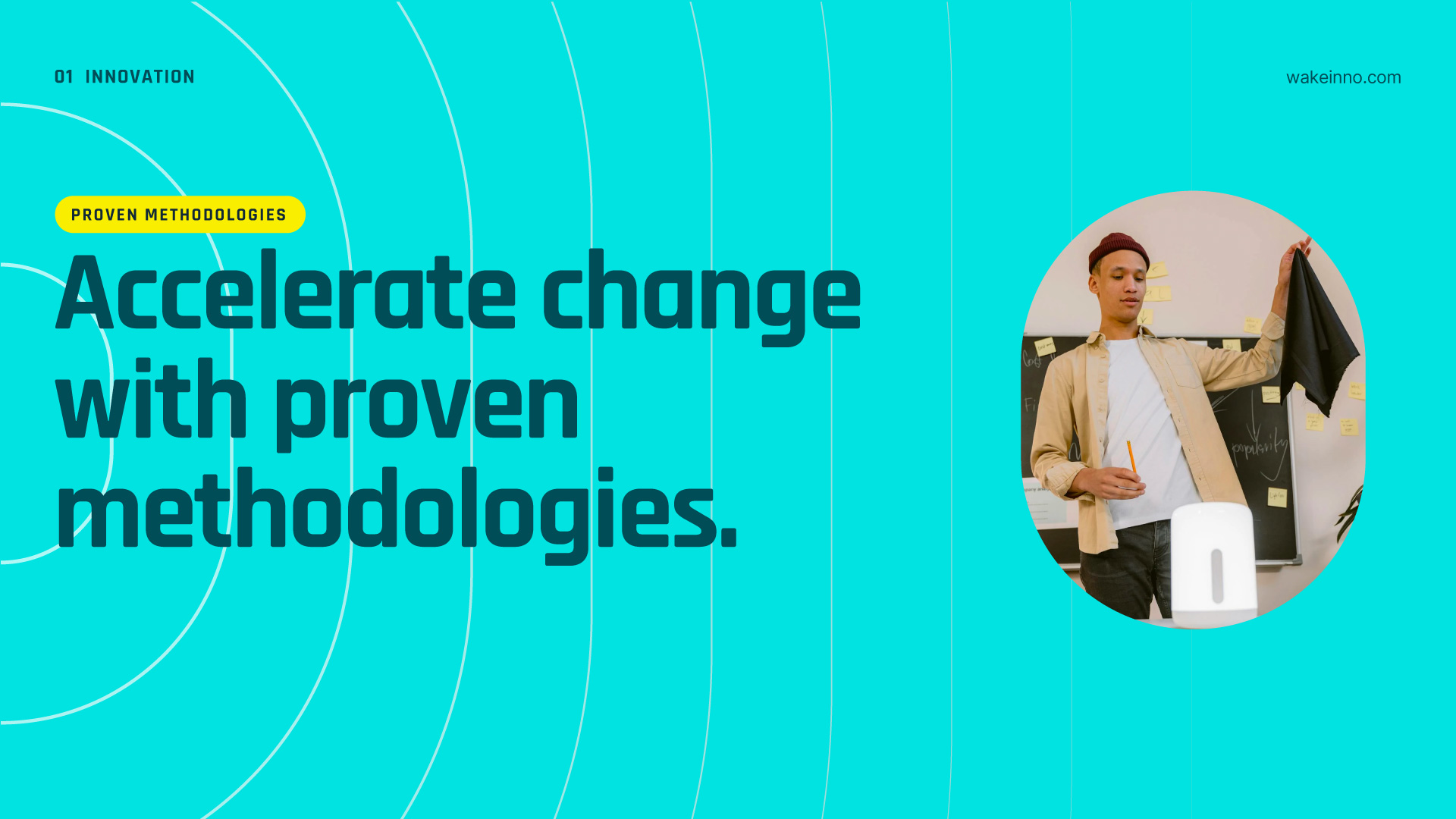
Photography
Illuminating ideas is the photographic style of Wakeinno that combines collaboration and technological innovation.
Style
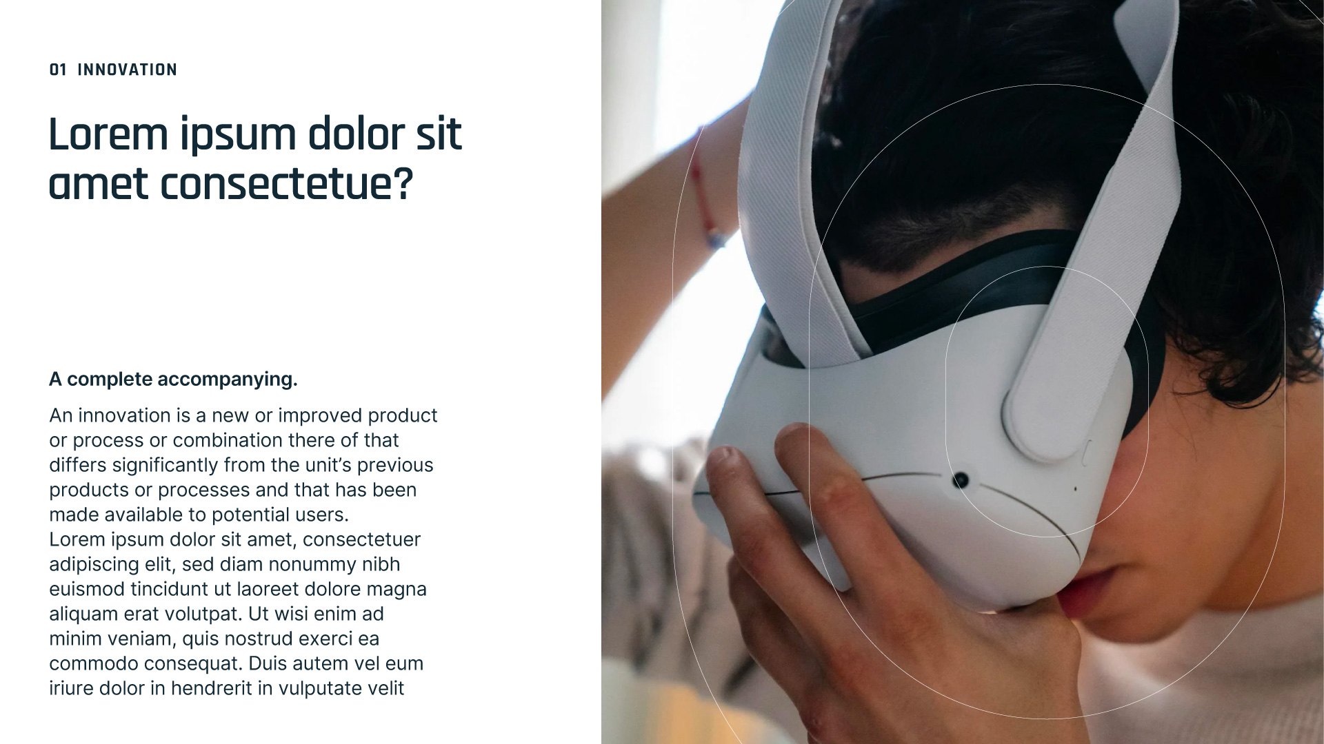
The photographic style chosen for Wakeinno is characterized by natural light coming from a window, creating a welcoming atmosphere. The images depict groups of people engaged in brainstorming activities, accompanied by IT tech elements that enrich the context.
Grid
Below are the guidelines for combining all brand elements into layouts to create cohesive compositions.
Using a grid helps structure information and ensures that layouts are clean and organized.
We start with a grid with baseline lines spaced 36px apart and secondary lines spaced 18px apart.
Layouts
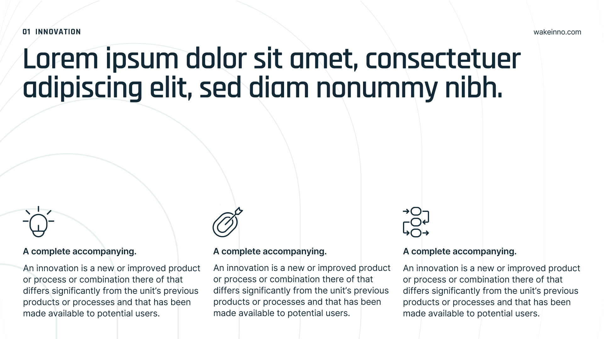
Once the grid is established, graphic elements are aligned to the grid lines. To facilitate the organization of information, you can use different layouts with 1, 2, 3, or 4 columns, with a margin equal to 2x the baseline grid.
1-Column layout.
2-Column layout.
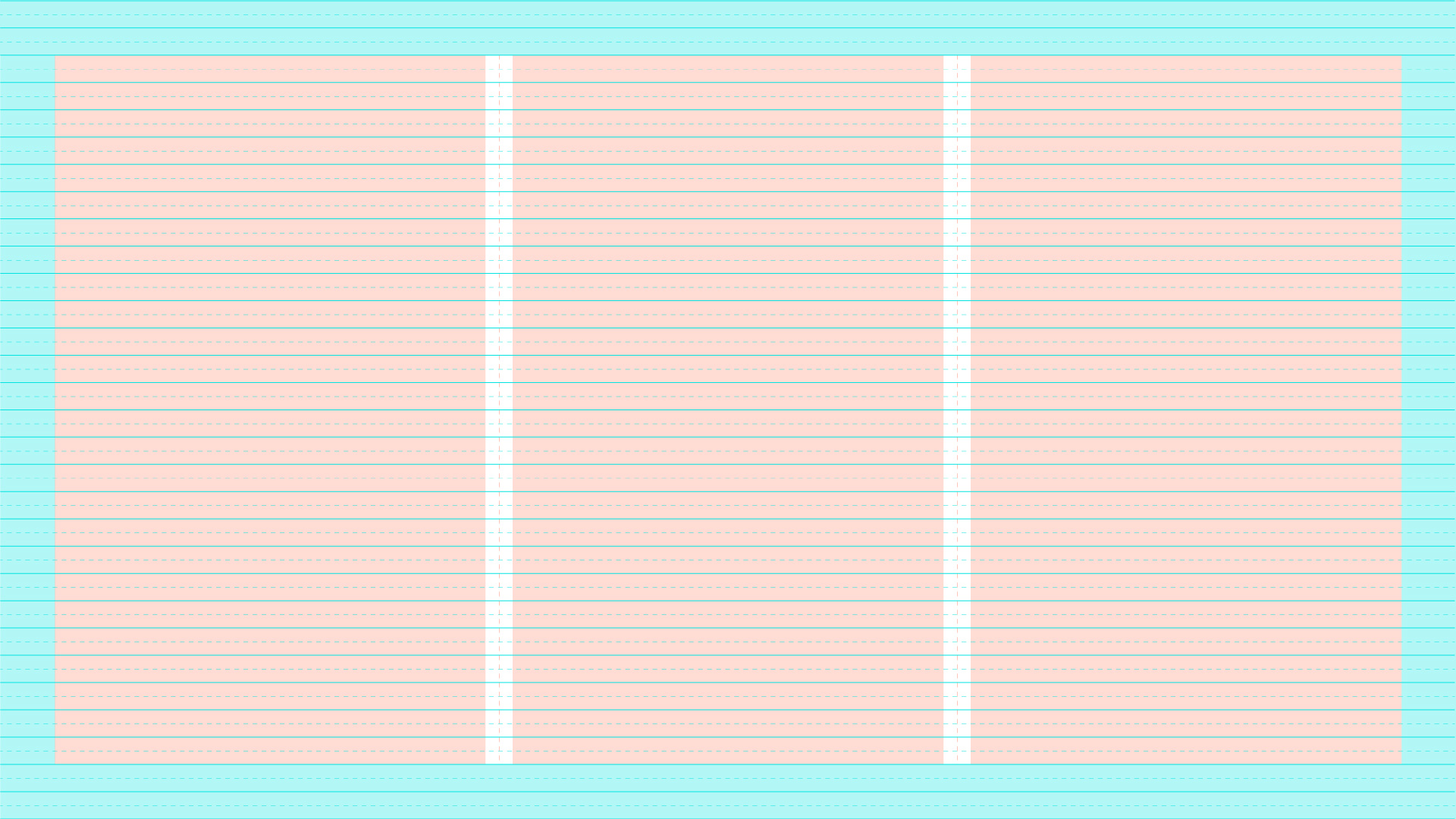
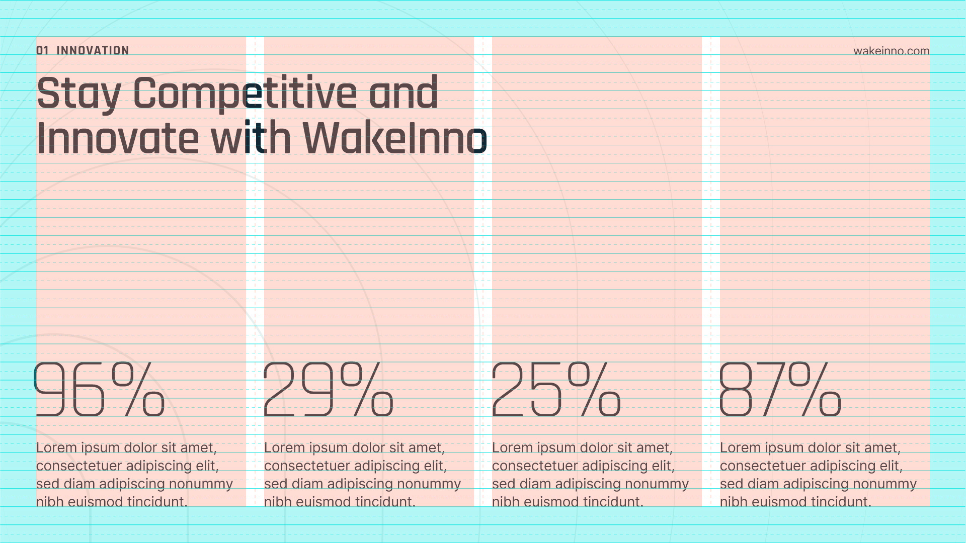
3-Column layout.
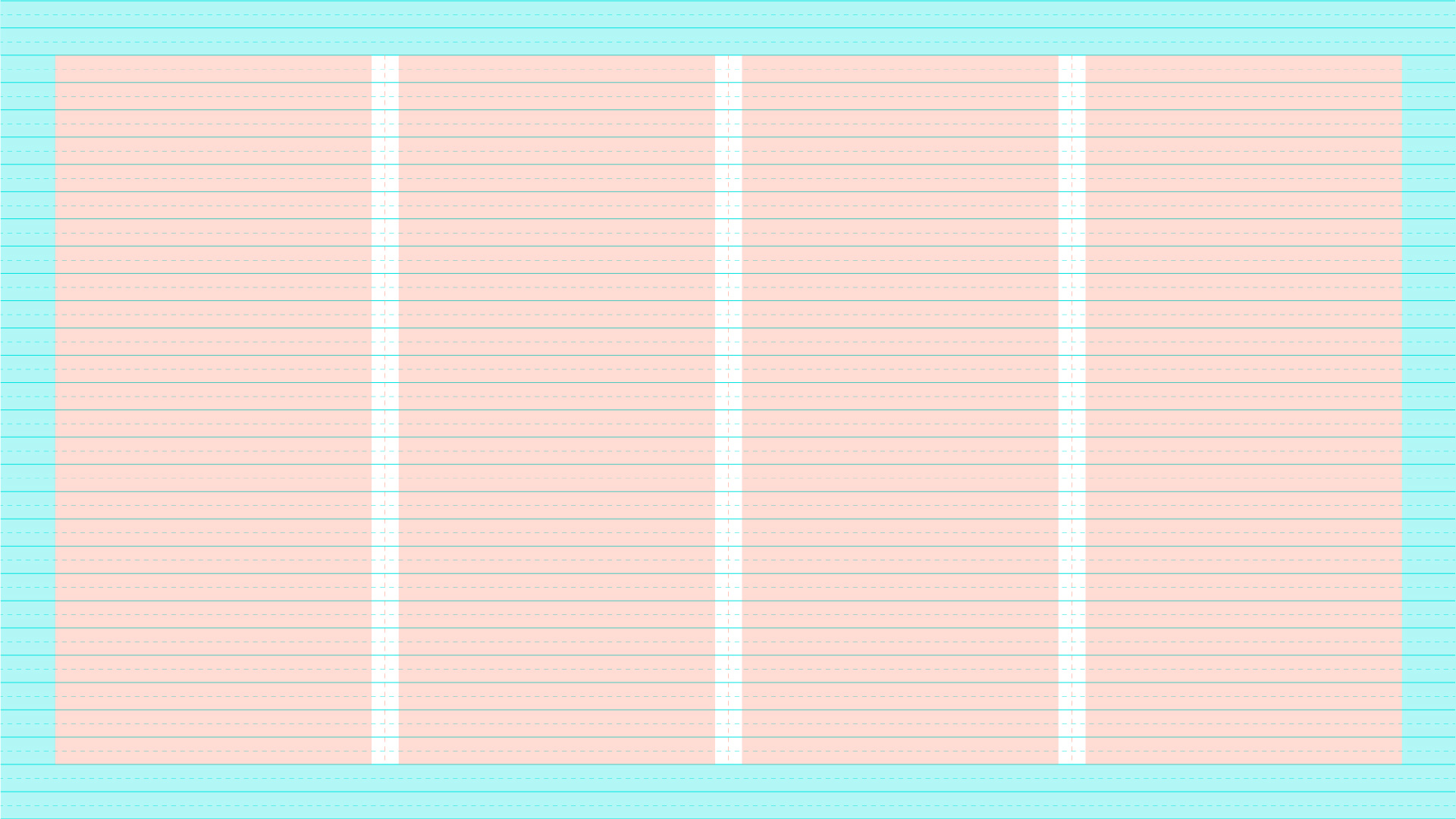
4-Column layout.
In use
Here you can find examples of element positioning. Always observe these guidelines carefully to maintain brand consistency.
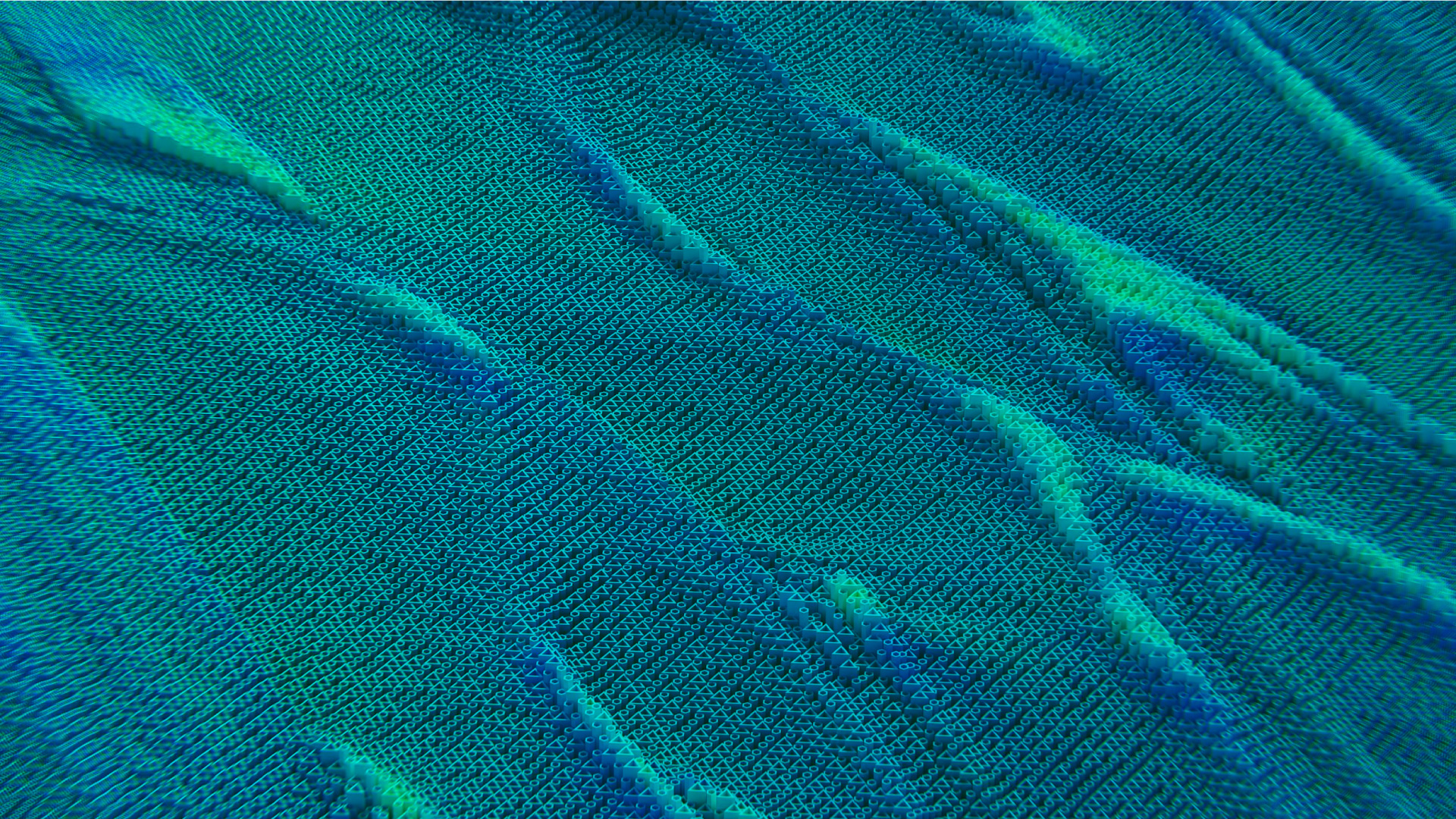
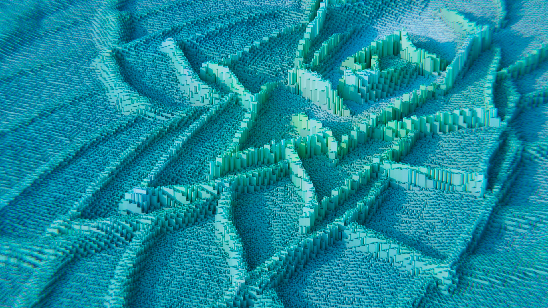
Gradient
The Wakeinno gradient is designed to convey feelings related to technology.
An alternative to a gradient background is to create or find a background with repeated abstract elements that evoke the concept of collaboration and technological shapes, using the colors of the brand palette.
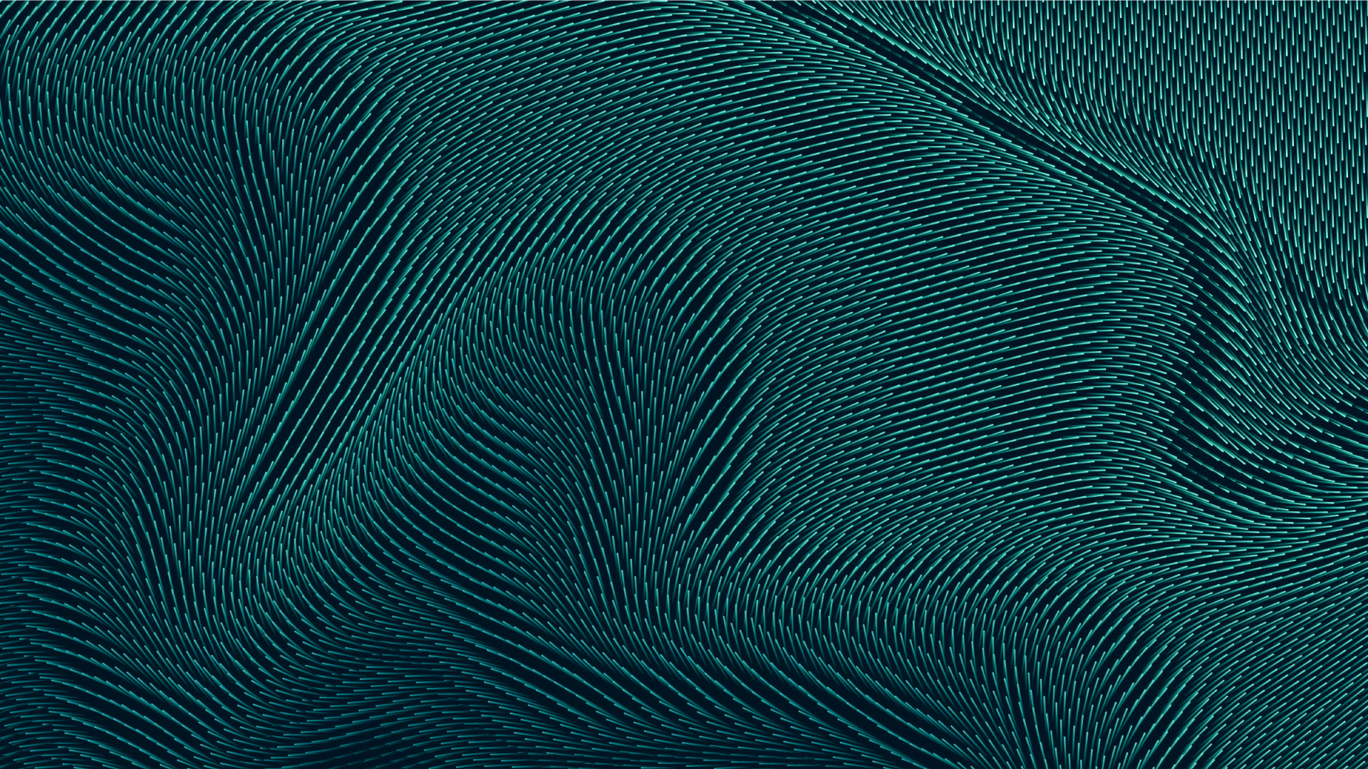
Wave Element
The main graphic element is the Wave, symbolizing collaboration and the generation of ideas.
It can be used on various occasions to highlight an element, such as a photo, or as a background element.
In use
You can position the wave element in various locations, such as centrally, laterally, at the bottom, or above the photos, to highlight the focal point.
Used centrally.
Used centrally as a background.
Used laterally.
Used laterally, in a different way.
Used in front of the photo.
Used as a background for slides.
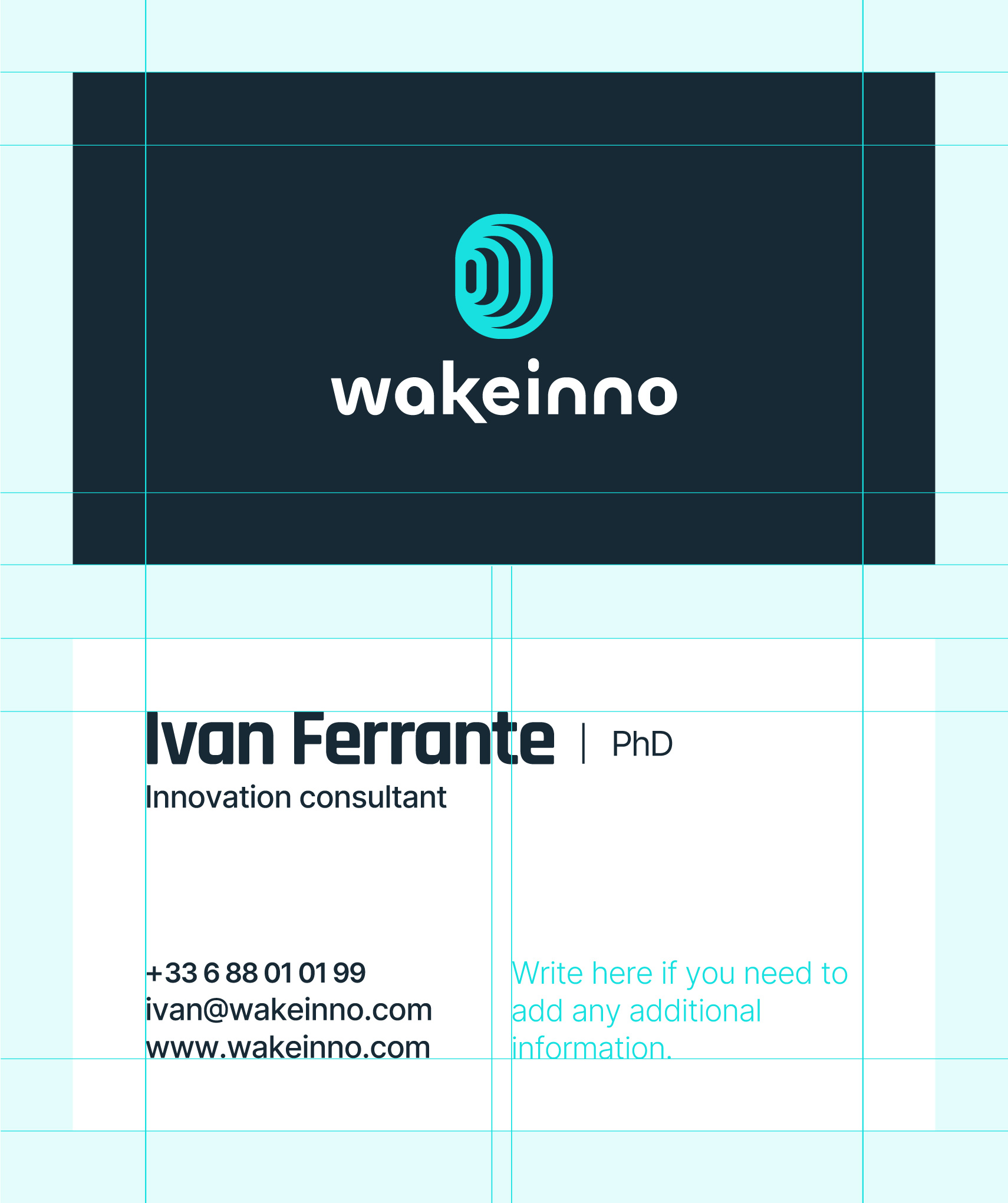
Business Card
The size of the business card is 890× 590 mm (W × H). The front features only the logo on a blue background, while the back is white to facilitate reading and printing.
If you need to add information, as shown in the example, please insert it in the second column.
Production Notes
Size: 890 × 590 mm (W × H) Material: White Paper (70-100 g/m²) Printing: Digital Printing Color: Blue (RGB: 23, 41, 53)
Font Usage
Name Rajdhani Bold 24 pt, Tracking -40 Title, Telephone, Email, Website Inter Medium 9 pt, Tracking -25


